Modern and recognizable packaging design for BIO sugar with dynamic visual elements.
- Client
- BIO Wekep Sheqer
- Year
- 2026

About the Project
The project encompasses the complete packaging design for the BIO Wekep Sheqer brand. The goal was to create visually appealing packaging for white sugar that communicates purity and high quality, tailored for the market in Macedonia and the region.
Challenge
The main challenge was to create a dynamic design that stands out from standard, simple sugar packaging while maintaining a sense of naturalness and hygiene. It was necessary to correctly integrate all legal requirements, such as the nutrition facts table and barcode, without compromising the aesthetic appeal.
Our Process
We opted for a dominant blue color symbolizing trust and purity, combined with white for freshness. A specific, fluid font was used for the brand name to introduce a sense of movement and modernity. The background is decorated with a subtle pattern of small house icons, adding extra texture to the design. The brand logo is centered, accompanied by green leaves that emphasize the “BIO” label and the natural origin of the product.
Result
The result is professional and modern packaging that clearly communicates the brand’s values. The design is consistent across all sides of the packaging, with clearly visible information regarding weight (800g) and quality, contributing to greater consumer trust.
Packaging elements
- Primary packaging design
- Creation of visual background pattern
- Integration of nutrition tables and technical data
- Brand typography development
- Coordination of colors and visual elements
Colour palette
#0056B3#FFFFFF#4CAF50#E31E24
Similar projects
Kadino - Promotiven Newsletter for Fresno Food Expo
Elegant and dynamic promotional design for presenting traditional products at an international fair.
Midway - Business Card Design
Organic and eco-friendly business card design focusing on sustainability and a global approach.
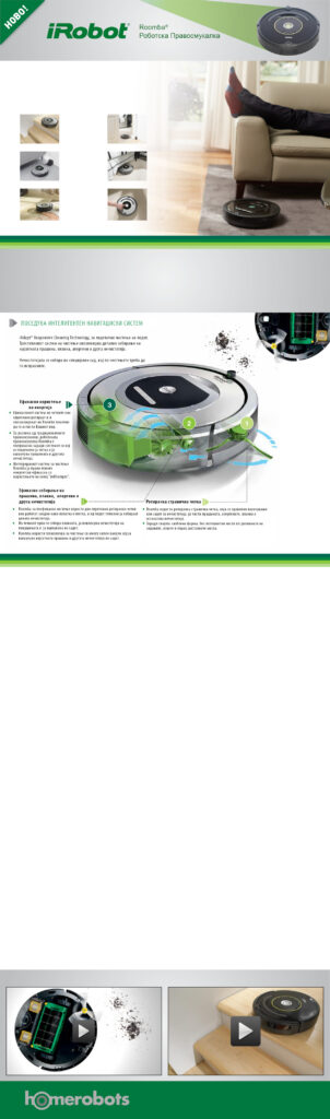
iRobot Roomba Marketing Materials
Visual representation of iRobot Roomba's innovative cleaning technology.