Attractive and dynamic packaging design with a recognizable branded mascot.
- Client
- Leona Cream
- Year
- 2026

About the Project
The project involved creating a visual packaging solution for dairy products under the Leona Cream brand. The design is intended for IML (In-Mold Labeling) packaging in a 400g tub format, where the key focus was to create a warm, family feel that evokes quality and taste.
Challenge
The main challenge was creating a dynamic and energetic visual identity that would stand out in the dairy spreads category. It was necessary to integrate all legal content requirements (ingredients, nutritional table, and barcode) without compromising the aesthetic appearance and the pleasant composition of the graphic elements.
Our Approach
We opted for a dominant red color that signals energy and attracts attention. The central element of the design is a cute lion mascot, which gives the brand character and makes it more accessible to children and families. The logo typography features rounded shapes and a 3D effect, further emphasizing the creamy texture of the product. The visualization of the product itself (spread on bread) is strategically placed to stimulate the desire for consumption.
Result
The result is a professionally crafted label that is visually consistent and functional. The design successfully communicates the Leona Cream brand through bold colors and a recognizable mascot, ensuring clear visibility of all necessary information for consumers.
Packaging elements
- IML label design for tub
- Creation of product visual identity
- Integration of branded mascot
- Placement of technical specifications and content
- Color optimization for printing
Colour palette
#E30613#FDFDFD#8CC63F#F9D37D#4A3B32
Similar projects
Midway - Business Card Design
Organic and eco-friendly business card design focusing on sustainability and a global approach.
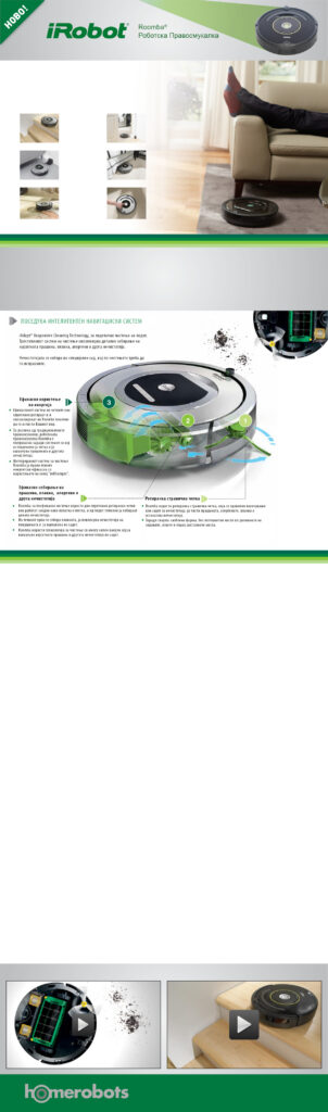
iRobot Roomba Marketing Materials
Visual representation of iRobot Roomba's innovative cleaning technology.
Kadino - Promotiven Newsletter for Fresno Food Expo
Elegant and dynamic promotional design for presenting traditional products at an international fair.